What We Deliver
Fractional GIS expertise to full-stack geospatial apps.
Our Services
From on-demand GIS expertise to custom web applications, we provide the tools and talent you need to solve your spatial challenges.
Jump to:
Interactive Mapping & Dashboards
Visualizing your data in a powerful, interactive way
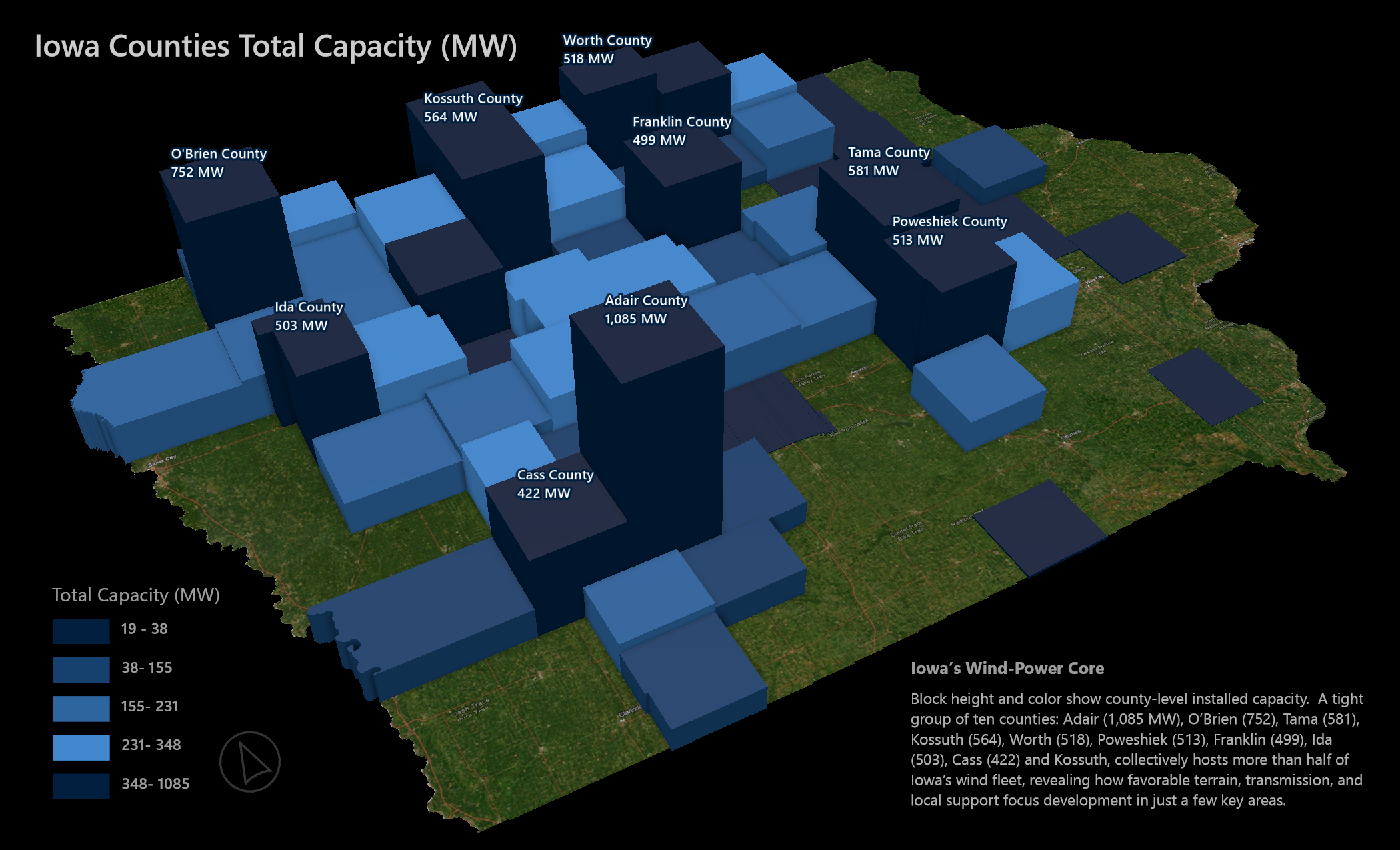
Iowa Wind Farm Dashboard
Geographic Distribution
Top Counties by Total Capacity
County Name
This wind farm dashboard shows how we design and structure your data into something your team can actually use. It combines a live choropleth map of Iowa with responsive donut charts, so when you hover over a county, the map and charts sync instantly to show total capacity, turbine density, or capacity per square kilometer, whatever metric matters most to you.
We built it with Mapbox GL JS and Plotly, fully styled with custom tooltips, theme toggles, and color ramps tied to real percentile rankings. The whole setup is flexible and fast, and it works on both desktop and mobile devices. If you've got a dataset and a goal, we can build a dashboard around it that makes sense to both technical and non-technical users on any screen size.
Constraint Analysis
Identifying buildable land for your projects
Newton County Missouri
Area of Interest
Acres: 14984.73
Buildable Land
Acres: 1473.745
Kuruka's constraint-analysis workflow starts with gathering every limiting factor that could shrink a project's buildable footprint. Whether you hand us a bespoke list of setbacks or we pull industry-standard layers ourselves. We compile easements, zoning buffers, critical-habitat polygons, slope rasters, flood zones, roads, and utility corridors, then load them into a single Geographic Information System. For GIS practitioners, that means a ruthlessly tidy PostGIS schema with spatial indexes; for everyone else, picture stacking all your paper plans on a light table so every "can't-build-here" line glows at once.
Once the data sit in place, we run a rapid series of clip, buffer, intersect, and erase operations: think of it as digitally cutting the unusable slices out of a block of clay until only the solid core remains. The result is a clean "go/no-go" map showing exactly where equipment can roll, foundations can be poured, or turbines can spin. GIS pros receive the full geodatabase and reproducible scripts; construction teams get a clear map and acreage counts they can trust in the field. Bottom line: you know why an area is off-limits and where you're free to build, no guesswork, no delays.
Geospatial Comparisons & Statistical Analysis
In-depth analysis to uncover insights
Buildable Land Overview
Renewable Siting Metrics
Beyond simple overlays, we conduct rigorous statistical analyses to uncover deep, actionable insights from your spatial data. Our advanced visualization techniques help identify patterns and relationships that might otherwise remain hidden. The interactive charts display key metrics and breakdowns of land suitability factors, allowing stakeholders to make informed decisions about resource allocation and development potential.
Our approach combines classic geospatial techniques with modern data science. We can help you answer complex questions like: Which environmental factors most impact land suitability in a given region? How does terrain variation affect development potential across different soil types? What is the optimal location for a new facility based on multiple geographic constraints? We provide not just maps, but clear, data-driven answers to guide your strategic decisions.
Spatial Data Acquisition & ETL
Sourcing and preparing the data you need
Our data engine never sleeps. It polls the usuals like USGS for elevation data, the National Hydrography Dataset for surface water, HIFLD's critical-infrastructure feeds, county parcel rolls and pushes far beyond that shortlist whenever a project demands it. Each feed is deduped, re-projected, and stress-tested before it earns a place in our PostGIS warehouse, so every layer lines up with every other one from the first query forward. You can tap the stack however you like: OGC map and feature services, a direct connection string, or zipped shapefiles/GeoPackages ready for offline work. And if you need something niche like tribal data, NOAA nautical charts, or solar radience datasets... well we already have the hooks to pull it in.
Cartography & Map Production
Creating beautiful, informative maps
Need a board-ready PDF, a wall-sized poster, or a clickable web map that feels effortless on a phone? We start with the same vetted spatial database, then let the medium drive the rest. Color hierarchies, scale-matched symbols, and disciplined typography anchor the work in classic cartography; vector tiles, viewport-responsive styling, and data-driven motion push it into the present. From hi-res static exports and georeferenced rasters to embeddable dashboards and lightweight component maps, every deliverable lands consistent, legible, and ready for its audience, whether that audience is scrolling, printing, or pinning the map to a conference-room wall.
Geodatabase Design & Maintenance
Structuring and managing your spatial data
We design lean, index-rich PostGIS schemas, load and validate every layer, then automate health checks, backups, and index tuning so queries stay fast and uptime stays near-perfect. Continuous monitoring dashboards flag issues before users notice, and version-controlled migrations roll out new data with zero downtime. In short: a rock-solid geodatabase that scales smoothly while you focus on insights, not maintenance.
We design lean, index-rich PostGIS schemas, load and validate every layer, then automate health checks, backups, and index tuning so queries stay fast and uptime stays near-perfect. Continuous monitoring dashboards flag issues before users notice, and version-controlled migrations roll out new data with zero downtime. In short: a rock-solid geodatabase that scales smoothly while you focus on insights, not maintenance.
Automated Workflows & APIs
Streamlining your processes and saving you time
Live Weather Automation Demo
Automation Engine
NOAA Weather Data
Wind Speed (mph)
Temperature (°F)
This wind-demo isn't just a weather widget. It's a working proof-of-concept showing how we can connect any external service into a seamless, end-to-end workflow. One search triggers a whole chain: Mapbox handles the location lookup, NOAA pulls in live weather, Plotly charts it on the fly, and if needed, SendGrid fires off a branded report instantly. No reloads, no exporting, no waiting for someone to email you later.
In real deployments, we use the same structure with dozens of other services like OpenAI for smart document summaries, Dropbox and SharePoint for file intake, PostgreSQL for automated data refresh alerts, and Slack or Teams to keep your team in the loop. The point is, we make all the behind-the-scenes work disappear. You get clean dashboards, fast results, and real-time updates without ever having to worry about how it all runs.
Custom AI Agent Development
Secure, enterprise-ready AI assistants for your workflow
graph TD
    A[User Query] --> B[AI Agent]
    B --> C{Task Router}
    C --> D[RAG System]
    C --> E[MCP Tools]
    C --> F[Custom Functions]
    D --> G[(Vector Database)]
    D --> H[(Knowledge Base)]
    E --> I[External APIs]
    E --> J[Database Queries]
    E --> K[File Systems]
    F --> L[Business Logic]
    F --> M[Validation]
    B --> N[Response Generator]
    N --> O[Return Output / Execute Action]

    style B fill:#3b82f6,stroke:#1e40af,color:#fff
    style C fill:#8b5cf6,stroke:#6d28d9,color:#fff
    style D fill:#10b981,stroke:#059669,color:#fff
    style E fill:#f59e0b,stroke:#d97706,color:#fff
style F fill:#ec4899,stroke:#db2777,color:#fff We build custom AI agents that plug directly into your business, not generic chatbots. We use secure platforms like Azure AI Foundry, AWS Bedrock, and Google Vertex AI, and we build them to work inside your existing workflow with your real data, not just internet knowledge.
Using MCP, we connect these agents to your databases, file systems, APIs, and business tools. They can read and write records, generate reports, run geoprocessing, and complete multi-step operations on their own. If you need a geospatial analysis assistant, a customer service agent that knows your documentation, or an internal automation agent that cuts repetitive work out of your day, we build it and deploy it.
Bottom line: your agent understands your domain, accesses your data securely, and produces consistent results. We handle the full lifecycle so you can focus on the actual business impact.
Custom Solutions
Tailored to your specific needs
Don't see exactly what you need? We specialize in custom geospatial solutions tailored to your unique challenges. Whether you need a specialized analysis, a custom data pipeline, or an entirely new application, we'll work with you to design and deliver the perfect solution.
Our team has experience across industries including renewable energy, real estate development, environmental consulting, and government agencies. We leverage the full stack of modern geospatial technologies to build solutions that are robust, scalable, and maintainable for the long term.