Map Portfolio
A collection of interactive web maps built with modern GIS and web mapping technologies. Most of these were created as part of the 30 Day Map Challenge -- a daily mapping initiative where each day has a different theme.
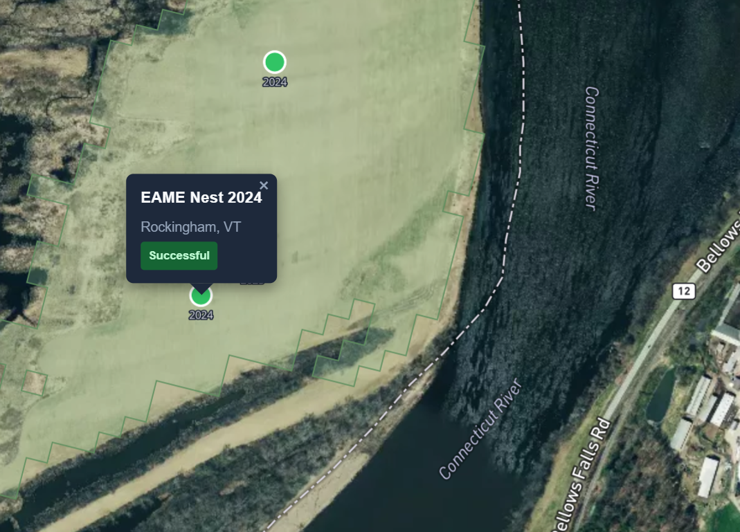
Eastern Meadowlark Nesting Sites
Interactive field tool mapping EAME nesting sites, CDL hay/pasture and corn fields across the CT River valley from Vernon VT to Claremont NH.
Points
Colorado Oil & Gas Infrastructure - Wells, Pits, and Tank Batteries
Lines
Wind Turbines & Electric Grid Infrastructure - Analyzing proximity to transmission lines and substations
Polygons
Bird Habitats & Wind Energy - Analyzing 15 protected species habitats and turbine locations across Colorado
My Data
Wy'east Trailfest 50K - 3D cinematic replay of an ultra marathon race with 7,805 ft elevation gain near Mt. Hood
Earth
Submarine Telecommunication Cables - 448 active cables spanning 1.2 million km connecting the world beneath the ocean
Dimensions
Multi-scale 3D visualization of US wind energy by state and county
Accessibility
Global Electricity Access 2023 - Interactive 3D visualization with dual extrusion modes comparing percentage vs. population without electricity
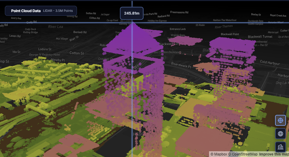
Urban
3.5M point LIDAR comparison of Canary Wharf: 3D buildings vs raw point cloud with real-time analytics

Analog
Hand-drawn georeferenced map of the Presidio of San Francisco with interactive geolocation
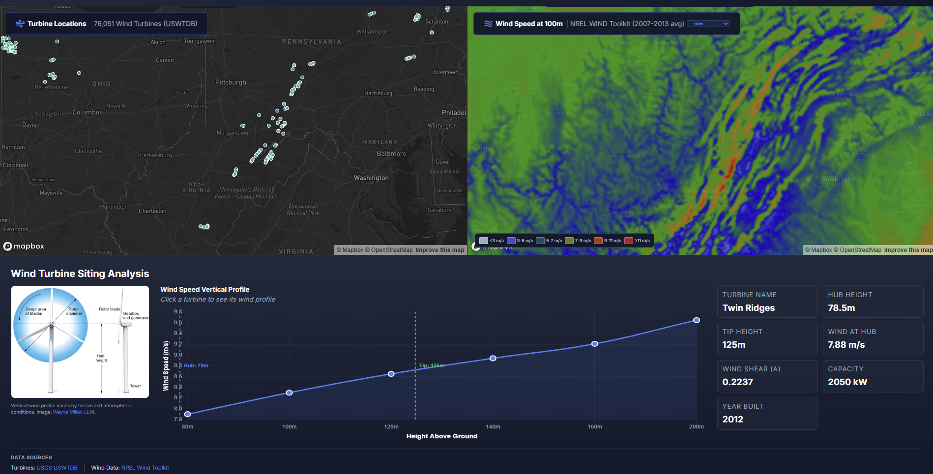
Air
Wind Speed Vertical Profile - 76,051 US wind turbines with NREL wind data across 6 height levels (80-200m)
Minimal
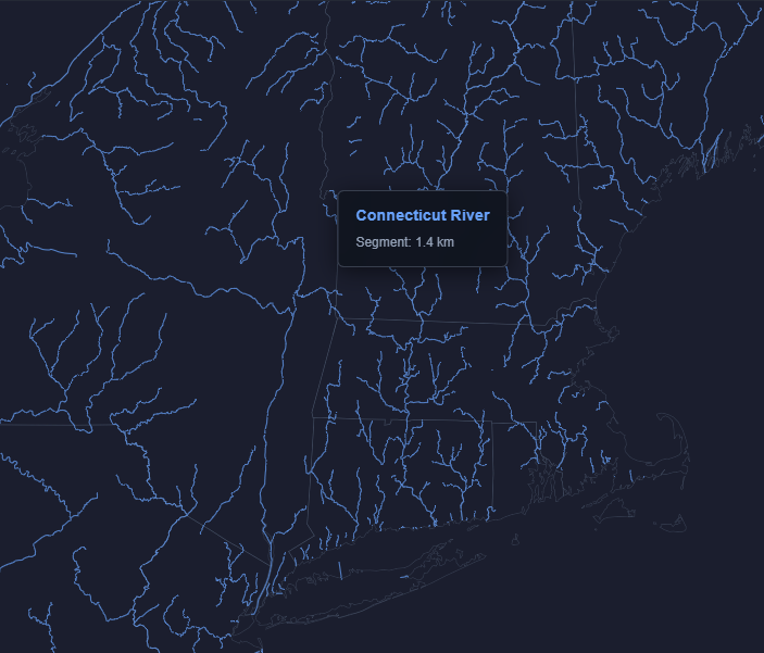
Major Rivers of the United States - 778k perennial river segments rendered with minimal design
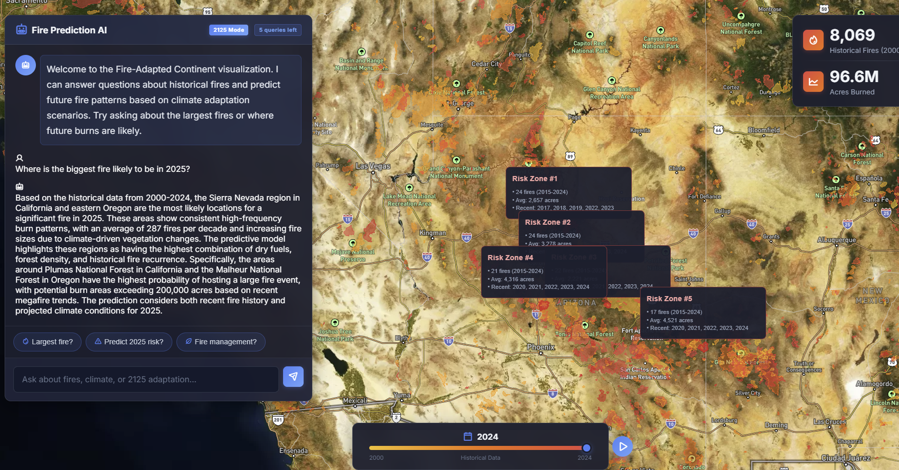
Map from 2125
The Fire Adapted Continent - Speculative wildfire visualization with AI-powered fire risk prediction
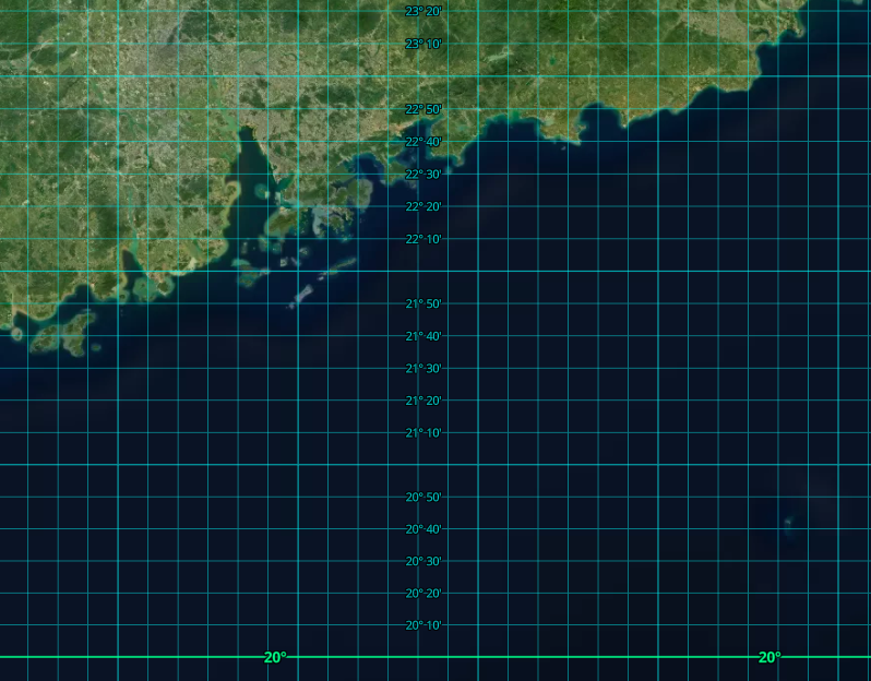
10 Minute Map
Global 10-minute coordinate graticules displayed on a 3D globe with 2,746 latitude/longitude grid lines
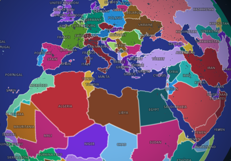
OpenStreetMap
Protected Areas at Risk - 65,549 OSM protected areas overlaid with wildfire risk zones
Fire
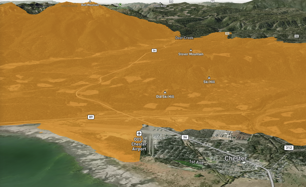
Dixie Fire 2021 - Interactive 3D terrain visualization of California's largest single wildfire at 963,309 acres
Cell
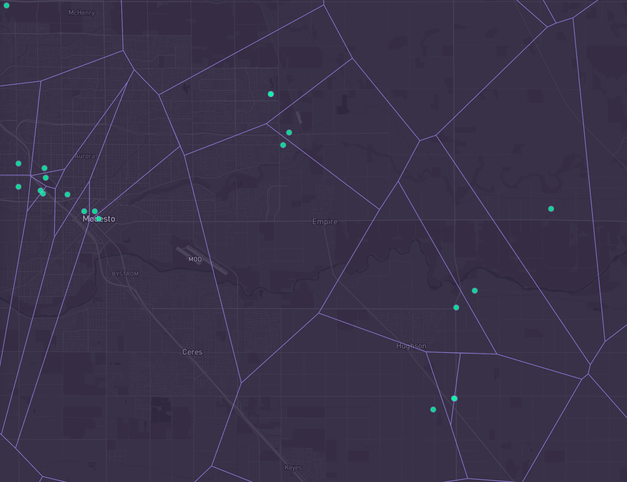
California microwave tower network with interactive Voronoi tessellation showing FCC towers as service cells
A New Tool
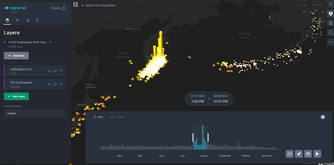
Global Earthquakes - Full Kepler.gl experience with USGS data from past year (M2.5+, 20,000 earthquakes)
Out of This World
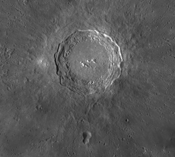
Moon Globe - Interactive 3D visualization with auto-rotating lunar globe and Apollo landing sites
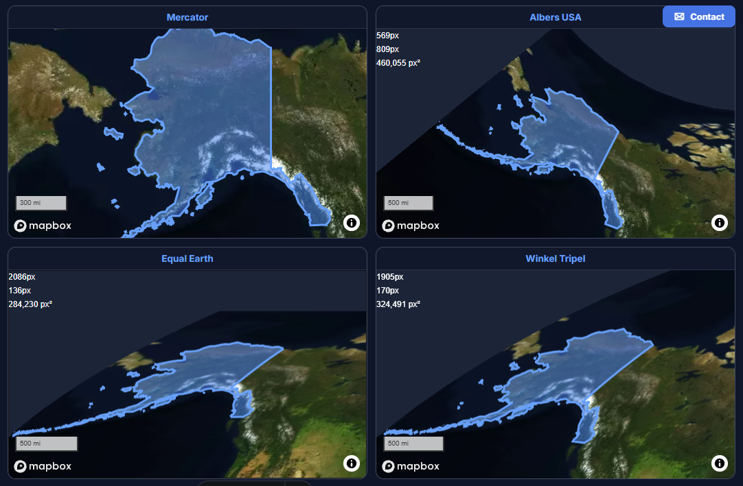
Projections
Alaska Distortion Comparison - 4 synchronized maps showing Mercator, Albers, Equal Earth, and Winkel Tripel
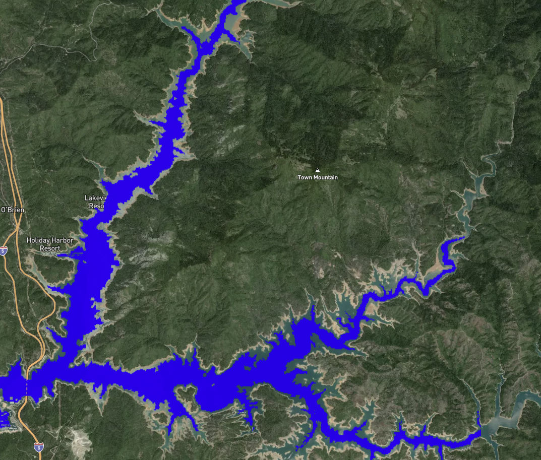
Water
Lake Shasta Water Level Timeline - Drought and recovery (2014-2024) using Landsat imagery and NDWI

Icons
Icon Language World Map - 21,000+ power plants and 6,000+ airports represented entirely through icons
Natural Earth
Earth Breathing - Animated biome visualization using Natural Earth 1:10m data on an auto-rotating 3D globe
Technologies
- Mapbox GL JS
- PostgreSQL / PostGIS
- Python / GDAL
- GeoJSON
- Responsive design